 July 2024
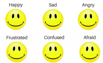
Colour affects behavior. We know that use of colour in public and private spaces can change the mood and perception of people. Casinos utilize unusual colour combinations to promote comfort and make their guests lose track of time. Schools, hospitals, restaurants and hotels all use colours to alter perceptions. That yellow McDonald’s logo and scheme is designed to make you hungry.
Blood pressure rises in a red room. Yellow rooms can cause headaches. For a sense of calm blue is good, and green helps people to be more articulate.
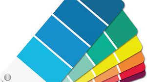
The impact of colour affects residential living environments. Planning a building-wide colour scheme is a major undertaking that residents will have to live with for a long time. The chosen colour scheme needs to work well 15 years into the future so chosen colours need to be those residents don’t tire of.
Residential buildings work best with a colour scheme designed to make residents comfortable living there. When updating common areas, choice of colour can improve the use and enjoyment of spaces.
Hallways should create a sense of comfort and safety. Neutral colours work well – brown, taupe, gray and white – with an accent color. The lobby can be a mix of warm and cool colours. Warm colours for furniture with brighter pillows or cushions. Area rugs can be a combination of colours. Wood is always more welcoming than steel and chrome. Always stick with classic colours while avoiding bright reds and oranges.
Consider the building’s residents. Artists appreciate something more creative and fun. Doctors, lawyers and business professionals are more conservative.